A practical boarding pass redesign
Improving the air travel experience is something of a passion of mine, so when I saw Tyler Thompson’s boarding pass redesign, I was intrigued. His article is well-thought-out and provoking, but unfortunately his redesigns don’t address a lot of the practical issues that airline travelers and airlines have to deal with.
Tim Morgan discussed some of the obvious shortcomings in his summary here, and after talking with both him and James Yu I’ve taken a first pass at a practical boarding pass redesign. (Edit: I’ve also discussed another use case here.)
Going over practicalities and priorities.
I had a few design constraints. First, no interesting typefaces or graphics: although they could vastly improve user experience, practically speaking, the machines that print boarding passes won’t be replaced soon. For this redesign, I stuck with one-weight Monaco. Likewise small gate maps of each airport would be ideal, but aren’t practical–so, that idea was scrapped, too.
Second, I constantly kept in mind that the ticket has at least two users, and usually three: both the traveler, who uses it as a reference, and also any TSA agent or airline employee that might need to inspect it.
For this example, I researched multiple airlines’ boarding passes to see what information needed to be included for all interested parties. I chose United Airlines as the airline here, mainly because I used them to travel home for the holidays this Christmas. With a lot of help from James, I’ve outlined checked-in, boarding-pass carrying airline traveler priorities as follows:
- Gate number
- Board time
- Boarding zone
- Seat number
- Departure time
And so:
The redesign itself.
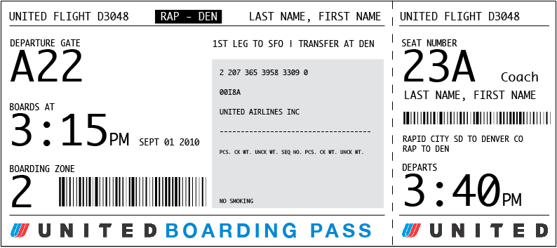
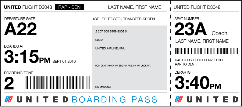
You’ll see that the ticket reflects the priorities I just listed for passengers. For the TSA officials scanning this boarding pass, they’ll see the information they’re looking for up top, where the untrained quickly learn to find it: airline, flight number, and passenger name (in the same order as the passenger’s ID).
For airline officials, most of their internal indexing numbers are inside the grey box–it’s grey so that it’s easy for the other parties to ignore. So far as I can tell, airline-only information is usually a bunch of ID numbers. In this mockup, I’ve also included a lot of abbreviations that were present on several boarding pass examples, though in every example I found online, they were left blank. Maybe someone in the airline industry can explain their purpose.
Because I’m a sucker for plain English instructions, I’ve included the text “First leg to [airport code] | transfer at [airport code]” above the grey airline-only box. I’m not sure whether or not it’s feasible to put leg numbers on boarding passes, but if one could easily put one’s transfer tickets in order, it would make travel that much more pleasant.
So let’s walk through some details.
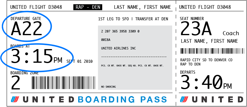
The passenger gets their ticket at the check-in counter or self-check-in kiosk. If they’re printing out tickets at home the night before, or received them in the mail prior to flight, they won’t get a gate, in which case the gate number will have tiny instructions to check with an airline employee. In any case, once travelers know their gate and are going through security, they’ll focus on this:
TSA agents, on the other hand, will be focused on this, especially the top row:
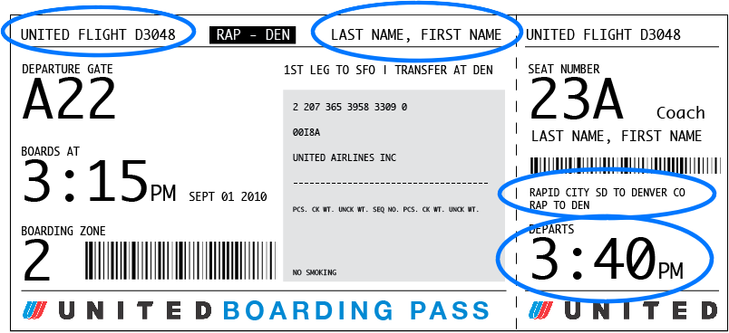
And of course, should there be any problems at the gate, the agent will be focused on this, particularly the information in and above the grey box:
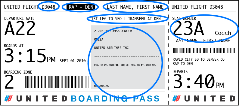
When the passenger is ready to board, they will care about this:
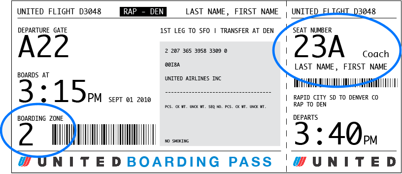
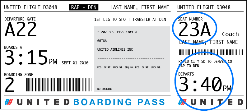
And when they are in the walkway, almost on the plane, they only have the right-hand ticket stub–which is fine, because they just care about this:
Though this redesign isn’t sexy, the important information will be obvious to whoever’s looking for it. TSA agents and airline agents are look at hundreds, if not thousands, of boarding passes a day, so despite the smaller type size, with this redesign they’ll be able to find what they’re looking for because the information they really need is grouped in a small and readable area.
For travelers, the benefits to this design are obvious. A lot of the changes I’ve made are similar to Thompsons’, but with a clearer information hierarchy and a more legible typeface.
A typographic addendum.
Speaking of legible typefaces, this design is typographically sound and if printing machine support it, should look good in a wide variety of typefaces. Here’s the same redesign set in Helvetica Neue (normal and bold).
—Timoni


